CS3226
Web Programming and Applications
Lecture 06 - Front-End (Bootstrap and Laravel View/Blade)
Dr Steven Halim
stevenhalim@gmail.com
Lecture 06 - Front-End (Bootstrap and Laravel View/Blade)
Dr Steven Halim
stevenhalim@gmail.com
Try this Bootstrap quiz @ W3Schools for self check
Outline
- Motivating Examples
- Screen Resolution
- Responsive Web Design
- Bootstrap, Why?
- Bootstrap Basics
- Laravel, Why?
- Laravel View/Blade
Motivating Examples
Review: CSS Zen Garden (from CSS lecture)
Knowing HTML5+CSS3+JS are not enough...
Good web design is an art and not purely science
Not-so-good Fact: Most (but not all) of us in Computer Science are technical people with "not-so-good design skill"
Can we do better?
Front-End (Client-Side) Design
To have good website design, you need to
knowmaster the language of the web and beyond...


What is shown to the first-time visitor of your web application is your front-end/client-side interface:
it can be a make-or-break moment
Screen Resolution
But... we have a BIG (or actually SMALL) problem...
Not all visitors of your website (web application) have (viewing) device(s) with the same screen resolution as yours, thus we need a good "screen real estate" management
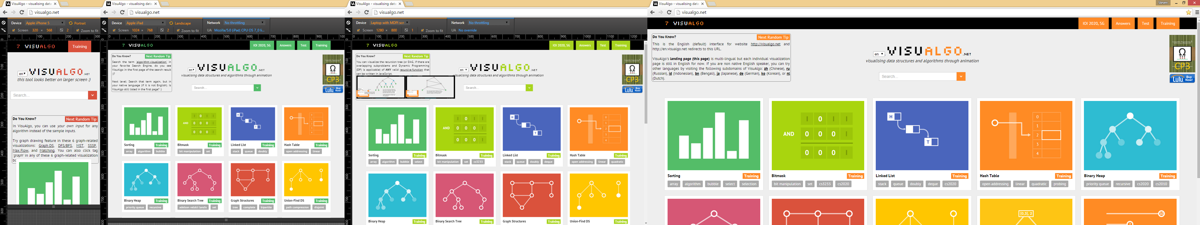
Google Chrome "Device Mode"
We can use Google Chrome "device mode" to (virtually*) check how our website looks like on different devices
Simplistic Way: Fixed Layout
What is a 'fixed' layout and what are the pros/cons of it?
Checking Screen Resolution
How can our webpage (web application) check the screen resolution and react accordingly so that our visitor can view our webpage better in his/her device?
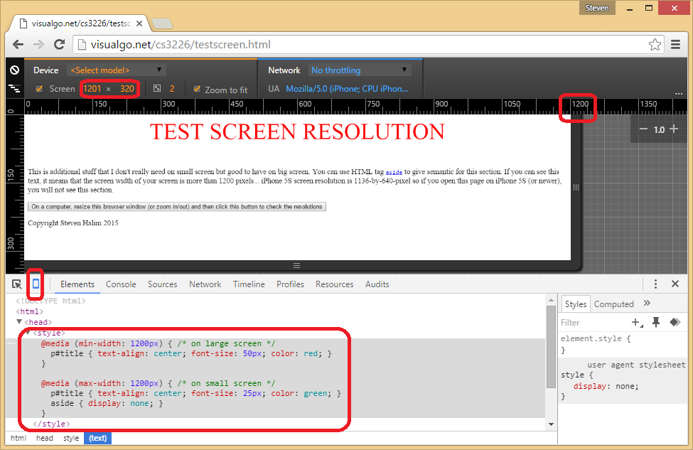
#1. CSS3 way (CSS media query)
Apply different CSS rules on different media
(that has different screen resolution/width)
/* In testscreen.html, we have these two rules */
/* if large screen (min-width: 1200px), apply these rules */
@media (min-width: 1200px) {
  p#title { text-align: center; font-size: 50px; color: red; } }
/* if small screen (max-width: 1200px), apply these rules instead */
@media (max-width: 1200px) {
  p#title { text-align: center; font-size: 25px; color: green; }
  aside { display: none; } }
Easy to use for simple applications,
but difficult for more complex ones
#2. JS (jQuery) way
Check screen.width, $(window).width(), or $(document).width() and manipulate the DOM programmatically
// example in testscreen.html
if ($(document).width() < 1200) // controlled with JS
  $('footer').hide();
else
  $('footer').show();
This JS way can be more flexible than CSS media query way
as JS is much more expressive than
the simple (implicit) if-else statement of CSS media query
#3. Any other simpler way(s)?
Read on...
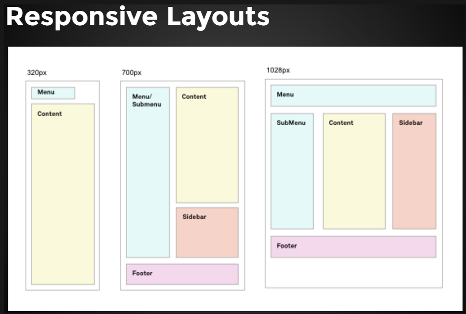
Responsive Web Design
The term responsive* is given to a webpage that can adapt it's content when loaded on different devices
- Large desktops (e.g. 1920x1080),
- Portable laptops (e.g. 1280x800),
- Mobile tablets (e.g. 1024x768/iPad2),
- Smartphones (e.g. 1136x640/iPhone5)
Let's explore several examples of responsive webpages
Design Philosophy
It is easier to go bigger if we start small
(Mobile-First Design Philosophy)
It is usually harder to do the other direction
But again it is all depends on the purpose of the web application, e.g. for VisuAlgo visualization pages, we decide not to support visualization on extremely small screen, but we make the landing/index page responsive
Key Ideas
Some key ideas for Responsive Web Design are:
- All sizes are in percentages, not in absolute numbers
- Elements are categorized based on importance and can be removed/hidden as needed
Bootstrap
It is not easy to create websites (web applications) that are responsive from scratch, e.g. (the front page of) VisuAlgo, but we can use some help :)
Introducing Bootstrap...

Bootstrap Background
Started by two Twitter engineers back in 2011 and have since been massively developed by various contributors
Their Tagline:
"Bootstrap is the most popular HTML, CSS, and JS framework for developing responsive, mobile first projects on the web"
Bootstrap is a Framework
Back in the Introduction lecture, we discussed the pros and the cons of using templates (frameworks)
However, using Bootstrap is more akin to using jQuery (on top of vanilla JavaScript) rather than using pure website templates, so I recommend it's usage to speed up the development of the front-end of your web applications
Bootstrap vs Competitors
There are other competing frameworks/libraries out there
We are using one of the most popular framework in CS3226
Bootstrap vs Self-Made Design
Once you are (much) more familiar with website design, you may start seeing the (current) limits of Bootstrap (e.g. your website design look 'too similar' too many other website that uses Bootstrap too) and will want to design your own (or contribute to this big project)
Bootstrap - Setup
Let's start by downloading the latest version
(and put them in our local copy, open source)
Or alternatively, we can just use these CDN* links:
<!-- Latest compiled and minified CSS -->
<link rel="stylesheet" href="https://maxcdn.bootstrapcdn.com/bootstrap/3.3.7/css/bootstrap.min.css" integrity="sha384-BVYiiSIFeK1dGmJRAkycuHAHRg32OmUcww7on3RYdg4Va+PmSTsz/K68vbdEjh4u" crossorigin="anonymous">
<!-- Optional theme -->
<link rel="stylesheet" href="https://maxcdn.bootstrapcdn.com/bootstrap/3.3.7/css/bootstrap-theme.min.css" integrity="sha384-rHyoN1iRsVXV4nD0JutlnGaslCJuC7uwjduW9SVrLvRYooPp2bWYgmgJQIXwl/Sp" crossorigin="anonymous">
<!-- Latest compiled and minified JavaScript -->
<script src="https://maxcdn.bootstrapcdn.com/bootstrap/3.3.7/js/bootstrap.min.js" integrity="sha384-Tc5IQib027qvyjSMfHjOMaLkfuWVxZxUPnCJA7l2mCWNIpG9mGCD8wGNIcPD7Txa" crossorigin="anonymous"></script>
Bootstrap - First Example
The first simple example on using Bootstrap
(to transform your frontend from "plain" to "cool")
Open multtable.html, the solution for this JavaScript challenge — "a standard HTML5 table with basic styling"
What's Next?
Bootstrap - Grid System (1)
This is one of the most important feature of Bootstrap
Basically, everything is inside a <div> container which can be fixed (default) or fluid (fill the width of the browser)
Inside container, we have one (or many) <div> rows
Each row is divided into 12 equal sized columns
Bootstrap - Grid System (2)
For each row, we decide how many columns a certain <div>
—that contains the actual HTML element(s) content—
has on different screen resolution by adding class(es):
.col-xs-*(very small).col-sm-*(small devices).col-md-*(medium devices).col-lg-*(large devices)
Bootstrap - Grid System (3)
We can give empty column offsets on different screen resolution using .col-xs/sm/md/lg-offset-*
We can also choose to hide a <div> on different screen resolution using .hidden-xs/sm/md/lg
See gridsystem.html example to get a clearer idea
All <div>s are highlighted with red border for clarity
Bootstrap Tour (1)
Using CS3226 & CS3233 Private IVLE
First, Bootstrap CSS classes:
- Grid system, revisited (more varieties)
- Tables, revisited (more classes)
- Buttons
Bootstrap Tour (2)
Next, Bootstrap components:
Bootstrap Tour (3)
Next, Bootstrap JavaScripts:
- Modal Dialog Box
- ScrollSpy (
<nav>+ JavaScript) - ToolTips (attribute + JavaScript)
- Alert (class + JavaScript)
Notes
For much more examples and detailed documentations,
just visit Bootstrap website directly
Or read this freemium Bootstrap tutorial from udemy
Other Design Aspects
Many other aspects have not been discussed, e.g.
- Choosing Color (scheme)
- Typography (font)
- Mouse Hover issue on Mobile
- Interaction Design, User eXperience/UX (CS3240)
- Supporting older web browsers?
- Etc...
Art vs Science
Again, good web design is (very) important for a successful web application, but this skill is an art and is hard to master
Multiple Pages Issue
Beyond the simplest web application, we usually use more than one pages in our web application
We usually want all pages in our application to have the same look and feel, e.g. the same top banner, navigational links, footer, and call the same set of (external CSS) and JavaScript libraries (e.g. jQuery, Bootstrap, etc)
The simplest, but also the worst method, is to copy a master html file, save it as another html file, and edit from there... This will cause maintenance issues as the project grows...
Introducing Laravel

Laravel is `the PHP Framework For Web Artisans'
(those who are skilled at web programming)
To setup this framework, you will need Composer
Then follow this installation document (your Lab TA will help if you still struggle with this first hurdle during Lab3)
MVC (Model-View-Controller) Design Pattern
Laravel follows the MVC architectural pattern, whereby we separate the Model (database++) separate from the View (Graphical User Interface) and we use the Controller to get input, update the model, decide actions, and rendering certain view
First, we concentrate on the Controller and the View parts of MVC framework in this lecture and will only touch the Model part in Database lecture
Routing and Simplest Controller
In Laravel (we use version 5.3), all HTTP requests will go through a central file routes/web.php, let's open this file...
Although we will only touch PHP in the next lecture, we can see a preview on how Laravel renders a view upon receiving an HTTP (GET) request as the PHP code is similar to JavaScript
Route::get('/', function() { // live demo on varying the '/'
  return 'Simple HTML response
 // live demo on varying the response
          This is the next line';
});
An Overview

Laravel View (Blade Templates)
Let's create our first view (page)
using Laravel Blade Templates (Basic Layout)
(file: 'resources/views/template.blade.php')
<!DOCTYPE html>
<html>
  <head>
    <title>Test App</title>
    <link rel="stylesheet" href="THAT BOOTSTRAP CSS STUFFS"...>
  </head>
  <body>
    @yield('main') <!-- Blade command: include section from child file -->
    @include('footer') <!-- Blade command: include other blade file -->
    <script src="THAT BOOSTRAP JS STUFF">
  </body>
</html>
Extending A Layout
With template/basic layout, we can derive child pageS...
(file: 'resources/views/index.blade.php')
@extends('template')
@section('main')
  <p>Aha, this paragraph will be inserted to the template
  </p>
@stop
(file: 'resources/views/about.blade.php')
@extends('template')
@section('main')
  <p>This is another view, see both files will have the same layout!
  </p>
@stop
Laravel View, Continued
We can also define blade file(s) that to be included in others
(file: 'resources/views/footer.blade.php')
<footer>
  <p align="center">© 2017 Steven
  </p>
</footer>
More Complex Controller
We can call:
php artisan make:controller SampleController
from our project folder and a new file will be available at
/app/Http/Controllers/SampleController.php
and we can customize it into:
<?php
namespace App\Http\Controllers;
use Illuminate\Http\Request;

class SampleController extends Controller {
  public function index() { return view('index'); } // show index view
  public function about() { return view('about'); } // show about view
}
?> // this ending line is optional
Updating the Routes
After we have our own Controller code, the routes become clearer
// nicer one stop view of all routes
Route::get('/', 'SampleController@index');
Route::get('about', 'SampleController@about');
Now test the simple app and notice that both the index and about pages contain the exact 100% repeated HTML headers, footers, Bootstrap CSS/JS, without mistake :)
If we then decide to change anything from the base layout/template file, all other child pages will inherit the updated content immediately :)
More about Laravel Soon
We have just scratched the surface of Laravel framework and we will expand our knowledge about this PHP framework in the next few lectures
You will also get your hands dirty with Laravel in our lab sessions, starting from Lab3
The End
Try this Bootstrap quiz @ W3Schools for self check